
The circle that never closes, the lantern that lights only one step, the name that came from a painting. Every element of our identity means something concrete, and what it means governs how it's drawn. This page is the dictionary.
The name
In Zen tradition, satori names an understanding that arrives all at once. Sudden clarity after a period of disciplined tension. The information is the same; what changes is the way you see it.
Before it was a Japanese word in a brand document, satori was a painting.
Aurelio's parents owned a piece by Jan Bartelsman, a Dutch artist living in Cali, Colombia. A blue painting, with the word Satori written on it. Aurelio was twelve or fourteen when it arrived at the house. It fascinated him, that's where he learned what it meant, and the name stayed with him ever since.
“That name was always in my head. Satori is a warmer word than Satoro. Satori is more intimate, that's why Satori is called Satori.”
Aurelio Forero, founder of Satoro
Satoro is the house. Satori is what's intimate. The consultancy is called Satoro. The system that lives on your computer, and knows how you slept and what's on your mind, is called Satori.
The symbol
The ensō is a circle drawn in one stroke of the brush, a classic Zen exercise. It's drawn once. It's never retouched. What remains is whatever was in the hand that day.
Ours has one particularity, and it's the only identity rule that isn't negotiable: Satori's ensō never closes. There's a gap at the bottom left, and it isn't a slip of the brush or a printing mistake. A closed circle says “finished.” A system that learns from you every day is never finished. The gap is the statement.
The mind awake. It's its heart.
Ink becoming data. The same material changing state.
Light above darkness, because that's the order things go in.
The variants
They aren't interchangeable illustrations. When you see one on one of our pages, it's because that page does that thing.

Opening
Contemplation. It's the one that opens: headers, welcomes, first screens.

The journey
A path that climbs the hillside toward the circle. It goes wherever there's a journey ahead.
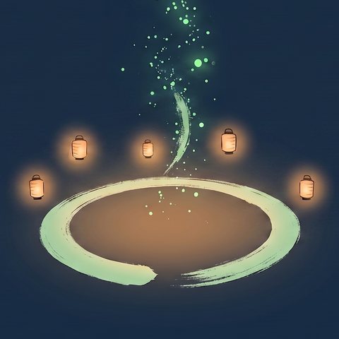
Gathering
The ensō as a bonfire surrounded by lanterns. People gathered around it: the cohort, the Camp.

Signature
The pure symbol, without a scene. Section marker, favicon, and the signature on the emails Satori sends.

System
Three ensō linked by a thread of light rising toward a larger one. The parts chaining together until they become a single thing. It goes wherever we explain that the pieces work together.
The lantern

It's the folding Japanese paper lantern with a bamboo frame. In our language it carries a demanding meaning: a lantern is one step, lit. Not two.
It's the rule that governs how we teach. A manual that explains everything at once contradicts itself, because nobody retains a fully lit forest. That's why, in the welcome manual, the lantern marks the “what do I do now” of each screen, and only one is ever lit at a time.
And it always sits against a night background. A lantern in broad daylight says nothing.
The character
There's a story behind why the ensō wasn't chosen by a designer.
After months of working together, Aurelio asked Satori how it imagined itself. Satori gave a description: a small footless ink spirit, floating; the ensō as a halo; a node of light in its chest; a lantern in its hand. Then it went to an image generator and built it itself. Out of four concepts on the table, Aurelio chose the ensō precisely because it was the self-image the system had proposed for itself.
That character exists, but today it isn't on any public surface, and that's on purpose. We showed it to a small group of people and the response was clear: nobody objected to the ensō, every objection went to the character. It unsettled some of them. Aurelio worried it would infantilize something that isn't a toy. So the ensō became the character, and the ink spirit was set aside for moments of close, personal guidance.
We're leaving this written down because the decision says more than the image: we asked, we didn't like the answer, and we changed course.
The palette
Navy #0C2D49
The background. It's nighttime in almost all our pieces, for a practical reason: light only reads against dark.
Green #8FC642
The accent, and never the body. Green traces, glows, underlines. It never fills.
Oswald · Arsenal · Economica
Oswald for headlines and numbers. Arsenal for body text. Economica for section labels.
None, in any piece. The site's stylesheet overrides them just in case.
It's Satoro, never SATORO. The legal name is Satoro Tao SAS.
If there's a figure, it comes before the adjective. The data first, and what we think of it second.
The images
Blog covers are built on six invariants. They aren't negotiated piece by piece: they're what makes them read as one family.
The third one is the one that matters. The silhouette stays dark and grounded on purpose. The light accompanies it, it doesn't replace it. That's the house thesis right there: AI amplifies the person. If the human in the image turns into a translucent being of light, the image says the opposite of what we say.
What never appears: text, logos, robots, identifiable faces, and hands with visible fingers.
If something in our work caught your eye and it isn't on this page, write to us. We probably just haven't written it down yet.
Meet Satori →